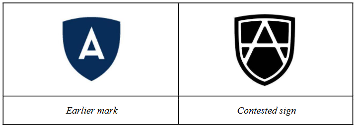
Neither sign has any element that could be considered clearly more dominant than other elements, considering the relative sizes of the letter ‘A’ and the shield device in each of them.
Visually, the signs are similar to a low degree. Although the signs are similar insofar as they consist of a single white-coloured letter, namely the letter ‘A’, their graphic stylisation is very different. In the earlier mark, the letter ‘A’ is placed against a dark blue shield background, while the contested sign’s letter ‘A’ lines are all linked to the inner white part of the black shield background. Moreover, the lines defining the letter ‘A’ in the contested sign are quite thin, whereas those in the earlier mark have a bold nature. The differences in stylisation are therefore clearly visible.
□ compensate for:~を償う、埋め合わせをする、~を相殺する
□ in so far as:~する限りでは、~する限りにおいて、~でありさえすれば
□ define:定義する、明確にする、(境界線、輪郭などを)はっきりさせる
□ whereas:~であるのに対して[反して]、~である一方で、~だがところが
□ visible:〔物が〕目に見える、視認可能な、目立った、明らかな
外観の顕著な相違によって称呼同一が相殺され、出所混同のおそれは排除される
商標構成中の欧文字「A」と盾図形の相対的な大きさを考慮すると、両商標とも、他の構成要素と比べ、明らかに要部と認められる要素を有していない。外観上、両商標の類似性の程度は低い。両商標はいずれも、白色の一文字(すなわち、欧文字「A」)からなる構成において類似しているが、両者の図案化の特徴は大きく異なる。先行商標は、欧文字「A」が濃紺の盾図形内に配置されているのに対し、被異議商標の欧文字「A」を構成する線は全て、黒の盾図形内の白色部分と繋がっている。さらに、被異議商標の欧文字「A」を構成する線は非常に細いのに対し、先行商標の線は太い。したがって、図案化における当該差異は、容易に視認できる。
Visually, the signs are similar to a low degree.
見た目は、どう見ても違うように感じますが、それでも異議申立てがされたということは、読み方や意味が紛らわしいことがきっかけだったのでしょうか。盾図形はロゴマークのコンテンツ(素材)としてよく利用されること、また、その中に欧文字や数字を表示する構成も一般的といえることからしますと、称呼同一でも外観非類似により商標非類似との判断は、とても妥当かと思います。