
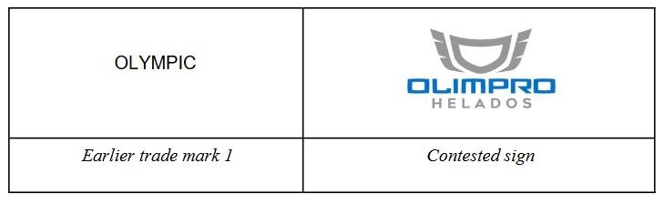
This word element ‘OLIMPRO’ stands out from the other elements, namely the abstract figurative element and the non-distinctive verbal element ‘HELADOS’, due to its prominent position placed in the middle of the sign and its eye-catching blue font, in a darker shade than the lighter greyscale of the sign. Accordingly, it is also the dominant element of the sign.
According to settled case-law, where a figurative mark containing word elements is compared visually to a word mark, the marks are held to be visually similar if they have a significant number of letters in the same position in common and if the word element of the figurative sign is not highly stylised, notwithstanding the graphic representation of the letters in different fonts, in italics or bold, in lower case or upper case, or in colour.
□ stand out:目立つ、際立つ、他と違う、並外れる
□ prominent:著名な、優れた、目立つ、突出した、卓越した
□ eye-catching:人目を引く、目立つ
□ greyscale:グレースケール(白と黒の明暗・グレーの濃淡で表したもの)
□ notwithstanding:~にもかかわらず
□ representation:表現、描写、代表・代理、象徴
「OLIMPRO HELADOS」と「OLYMPIC」の称呼及び観念の類似性は、平均程度 - 5
「OLIMPRO」の文字部分は、被異議商標の中央という目立つ位置と、被異議商標の明るめのグレースケールよりも濃い青色のフォントが人目を引くので、他の構成要素、すなわち、抽象的な図形要素や識別力を欠く「HELADOS」の文字から際立っている。したがって、当該文字部分は、被異議商標の要部ともいえる。
確立された判例法によれば、文字要素を含む図形商標と文字商標との外観を対比する場合、構成文字の書体(イタリック体・太字体)や大文字・小文字、色彩に差異が有るとしても、構成文字の並びの大半が共通する場合、文字要素の図案化の程度が高度でない限り、両商標の外観は類似すると判断される。
prominent position placed in the middle of the sign and its eye-catching blue font, in a darker shade than the lighter greyscale of the sign
商標は、原則として、全体で一つのモノと捉えるのですが、「要部」という概念が、日本に限らず出てくる場合があります。商標の「要部」とは、構成要素のうち、出所識別機能を強く発揮する部分を指しており、本件では、「prominent element」の英語表現が使われています。商標のどの部分が「要部」なのか?これは、商標の実務スキルに深く絡むテーマで、商標の紛争の多くが、商標の類否(要部認定)が関わっています。本件では、「OLIMPRO」の文字部分の位置(position)や色が判断材料とされました。