
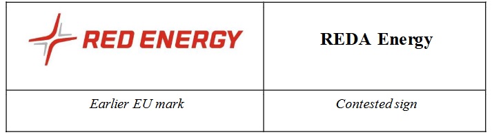
The fact that the first verbal element of the contested sign ‘REDA’ contains one more letter than the corresponding verbal element ‘RED’ in the earlier mark, further contributes to the visual divergence of the signs. In addition, the vowel ‘A’ is a rather bulky letter which is therefore not overlooked, and leads to a visual lengthening of the first, distinctive verbal element. The coincidence in the second non-distinctive verbal element ‘energy’ is not suitable to counteract or outbalance these visual differences.
EUIPO > Opposition > Second Board of Appeal > case R 789/2025-2 (2 October, 2025)
□ further:なお一層、さらに
□ divergence:相違、逸脱、分岐
□ bulky:かさばった、大きい、扱いにくい
□ lengthening:延伸、長くすること、延長
□ outbalance:超える、~よりまさる、重要である、圧倒する
商標「RED ENERGY」は、エネルギーとの関係において、「REDA Energy」と出所混同のおそれなし ― 2
被異議商標の最初の文字要素「REDA」が、先行商標のこれに相当する文字要素「RED」よりも1文字多いという事実によって、両商標の外観は、さらに相違する。加えて、母音「A」は、比較的大きく目立ち、見落とされ難い文字であることから、外観的に、識別力のある最初の文字要素が長く見える。識別力を欠く2番目の文字要素「energy」が一致するとしても、外観上の当該差異を相殺または凌ぐほどではない。
not suitable to counteract or outbalance these visual differences
商標の類否を判断する際、最近では、国内外とも、商標の構成要素の個々又は全体における共通点と相違点を並べ、それらの共通点が相違点を凌駕するか(又は、その逆)をもって、結論(類似・非類似)を出す手法が一般になっています。本件のEUIPOの判断は、「RED」の語から明確な意味合いが生じることを考慮すると、日本でも同じ結論になるかと思います。